UNM Color Palette
Primary Brand Colors:
Our cherry red takes its inspiration from the crimson glow of the majestic Sandia Mountains at sunset. Our silver, from the Rio Grande that looks like a shimmering strip of silver winding through the Albuquerque basin. Both colors have been an essential part of our brand for more than 100 years. Whenever possible, these official colors should be utilized in brand communications.
Cherry
HEX: #ba0c2f
CMYK: 20, 100, 75, 0
RGB: 186, 12, 47
PMS: 200 C
Turquoise
HEX: #007a86
CMYK: 95, 42, 47, 0
RGB: 0, 122, 134
PMS: 7713 C
Silver
HEX: #a7a8aa
CMYK: 40, 28, 25, 0
RGB: 167, 168, 170
PMS: Cool Gray 6 C
PMS Silver Metalic: 877C
Lobo Gray
HEX: #63666a
CMYK: 75, 65, 55, 0
RGB: 99, 102, 106
PMS: Cool Gray 10 C
Secondary Colors:
There is a wide variety of secondary colors that may be used to help tell our story. All of these colors were carefully chosen because they effectively complement our primary brand colors and reflect the natural tones of our local New Mexico environment.
Please pay close attention to how and when you use them. And always consider whether it would be more appropriate to use our primary brand colors instead.
High Noon
HEX: #ffc600
CMYK: 0, 17, 100, 0
RGB: 255, 198, 0
PMS: 7548 C
Sandia Sunset
HEX: #ed8b00
CMYK: 0, 50, 100, 0
RGB: 237, 139, 0
PMS: 144 C
Terra
HEX: #c05131
CMYK: 15, 85, 100, 0
RGB: 192, 81, 49
PMS: 7580 C
Mesa
HEX: #d6a461
CMYK: 12, 38, 72, 0
RGB: 214, 164, 97
PMS: 7509 C
Green Chile
HEX: #a8aa19
CMYK: 37, 14, 100, 0
RGB: 168, 170, 25
PMS: 383 C
Deep Dusk
HEX: #8a387c
CMYK: 45, 95, 5, 0
RGB: 138, 56, 124
PMS: 7656 C
An Adobe Color Swatch file (.ase) is available for UNM CMYK and UNM RGB colors.
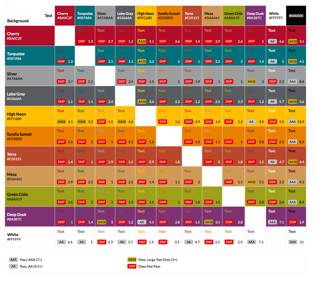
UNM Brand Color Contrast Check
Web Content Accessibility Guidelines are a series of guidelines designed to increase accessibility of web-based content.
Part of these guidelines are specifications of color contrast designed to be sure that color combinations are meeting ADA compliance for legibility.
Below is a chart of UNM RGB, HEX Brand Palette colors with combinations specified as:
- AAA Pass (highest level of accessibility)
- AA Pass (standard level of accessibility)
- AA18 Pass (only large text sizes will pass)
- DNP (Does Not Pass, Fail)
Though print guidelines for ADA accessibility vary by paper type, printer and other variables, the guide below can be used to detect possible issues in contrast compliance. We always recommend receiving printed proofs of any printed material to check for these color contrast concerns and to be sure your color is appearing correctly.
