Headline Treatments
The simplicity and flexibility of our headline style options will enable you to turn even simple, straightforward copy into something that feels special and on-brand. Below are some examples of how Vitesse and Gotham can be used to strong headlines.
Style 1
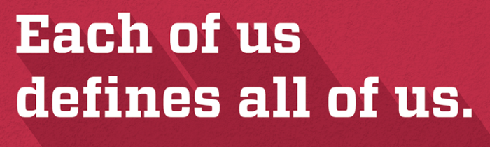
Use Vitesse bold or black to let strong headlines speak for themselves
Style 2

Use all-uppercase Gotham to create clean, simple messages. Reverse the headline out of rich tones to make it pop.
Style 3
Use an outlined version of Vitesse, uppercase and lowercase, ONLY when it’s necessary to improve headline legibility, for example, when using a light colored headline over a light colored background. Outlined versions of headlines should be used very sparingly.
Sub / Secondary Headlines
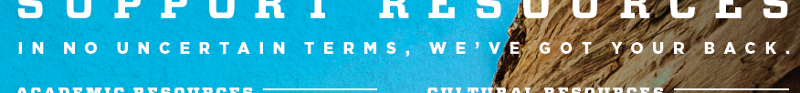
Create sub or secondary headlines using all-uppercase Gotham. These headlines may be used to create visual and informational hierarchy in messages. They are excellent vehicles to provide readers with a preview of what’s to come in body copy or to add an additional layer of clarifying information to the communication.
