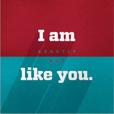
Shadows
This design move adds depth and texture to print and digital messages and is a subtle nod to the special way that light plays off of everything in New Mexico. Here, the sun draws dramatic shadows on all of our buildings, thanks in part to our distinct style of architecture. This graphic move may be used to call attention to headlines or to give graphic elements prominence.
Generally, shadows are made from a black layer that has been adjusted to a semi-opaque value. This gives them a gray tone. To achieve the desired results, the opacity of the original black layer may need to be reduced up to 95%. The final appropriate opacity value you choose— typically somewhere between 5% and 30%—depends entirely on what’s on the layers beneath it. Just make sure the shadows you create do not become ominous or overpowering. Color shadows may also be utilized.
Color shadows may be created from solid or semi-opaque brand colors, or, in rare instances, color photography. When they are semi-opaque brand colors, they should be laid over photography that supports the idea of the messaging.
LENGTH
Shadows can be any length. They can be short, but they should always be long enough to register as shadows. They may also be long enough to bleed off the edge of a page. Consider composition, consistency, and hierarchy of page elements when choosing the length of your shadows.
ALIGNMENT
Like in nature, all shadows should run parallel to each other.
LIFT
Shadows should always be applied to give elements or copy a lifted or vaulted quality. Our shadows are based in nature—as if coming from the sun in the sky. As a result, they should never flow upward from elements or copy.
Instructions on how to create shadows can be found in the downloadable UNM Brand Style Guide.
